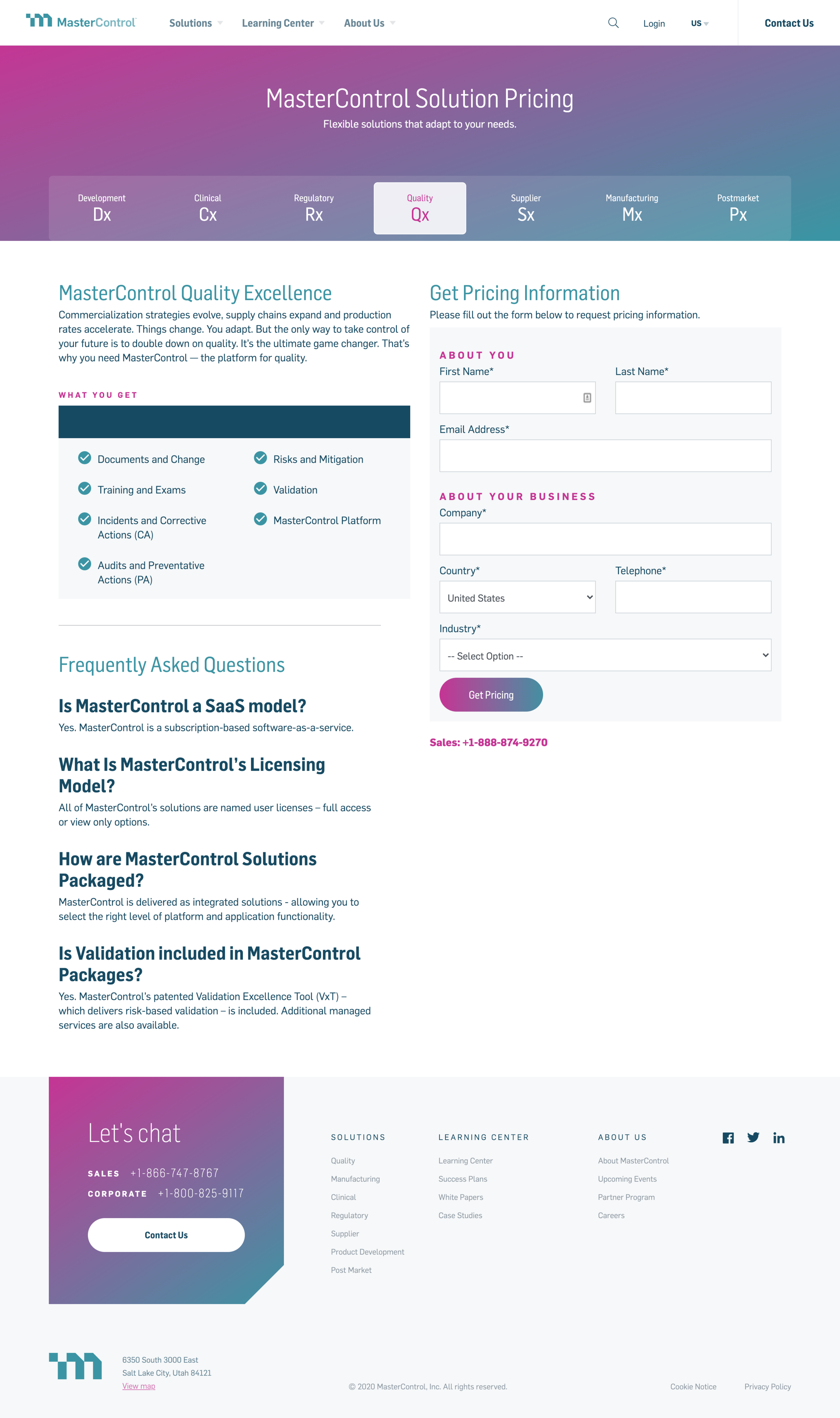
MasterControl’s site was outdated and overcrowded with information. Our goal on the digital experience team was to update the marketing site and bring it into the 21st century. We wanted it to feel sleek, confident, and communicate MasterControl’s mission, pricing, and feature set efficiently, all while resonating with the company’s newfound style and tone. The minimal but targeted content allows users to focus on MasterControl’s story and mission- to make shipping life-changing healthcare products easier, faster, and more efficient. We wanted the information that was displayed to feel inspiring and tell a story, without getting in the way of critical information. I worked on UX design, user research, prototyping, and low to high fidelity mockups.
I started my process by asking questions. What do people want to see on an overview page? How do I avoid overwhelming the user without coming across as too hands-off?
I came up with a few guiding design principles to keep in mind when determining the layout of my design concepts.
Simple and easy to understand
Narrative driven and visually appealing
Human and approachable


